
What is the EM to PX Converter?
EM and PX are two common units used in CSS for sizing text, spacing, and layout. A pixel (PX) is an absolute unit, while EM is relative to the font size of its parent element. This converter translates values between the two so you can move confidently between fixed and scalable measurements when building responsive websites.
How to use it
Pick a conversion direction — EM to PX or PX to EM — then enter your value and the base font size in pixels. The browser default base font size is 16px, which is pre-filled for you. Click calculate to see the converted result instantly.
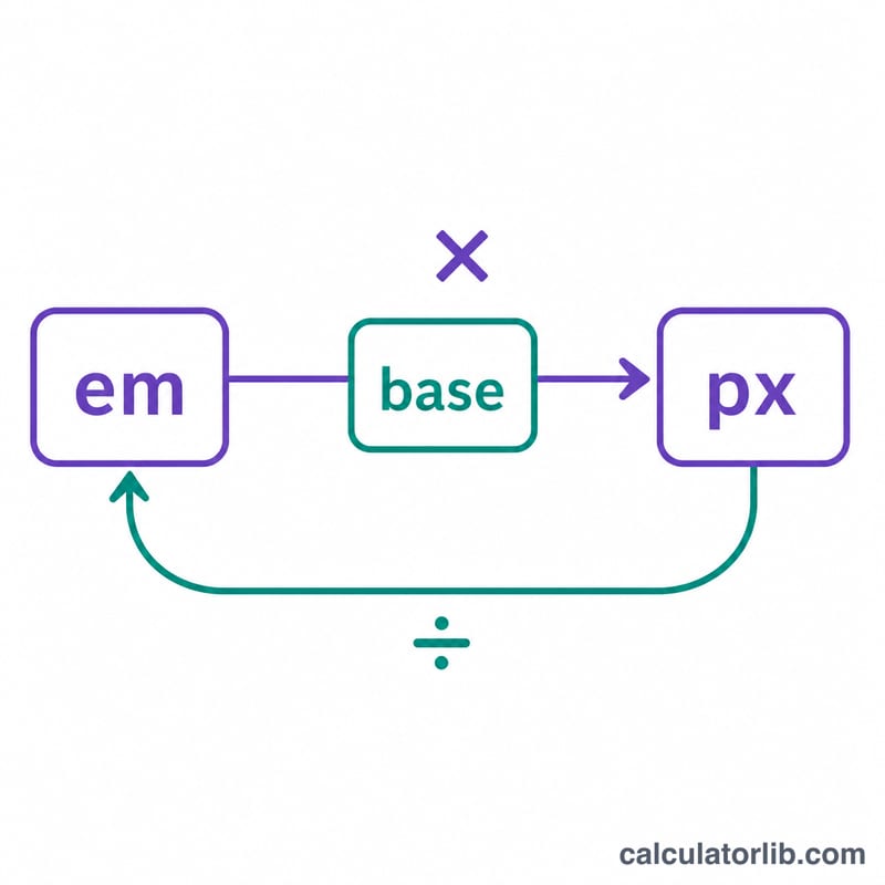
The formula explained
The conversion is a simple proportional relationship. To convert EM to PX you multiply:
$$\text{px} = \text{Value (em)} \times \text{Base (px)}$$To go the other way you divide:
$$\text{em} = \dfrac{\text{Value (px)}}{\text{Base (px)}}$$The base is whatever font size (in pixels) the EM value is relative to.
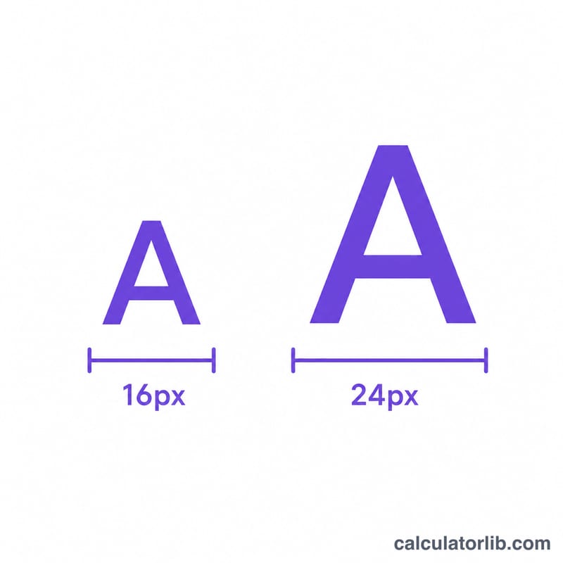
Worked example
Suppose you want to convert 1.5em with a base font size of 16px. Using px = em × base:
$$1.5 \times 16 = 24\text{px}$$Conversely, \(24 \div 16 = 1.5\text{em}\). If your base were 20px instead, 1.5em would equal 30px.
FAQ
What base font size should I use? Most browsers default to 16px. If you have changed the root or parent font-size in CSS, use that value instead.
Is EM the same as REM? No. REM is always relative to the root element's font size, while EM is relative to the nearest parent's font size. For REM conversions, use your root font size as the base.
Why use EM at all? EM units scale with font size, making designs more accessible and responsive when users change their default text size.