What is the EM to PX Converter?
The EM to PX Converter translates CSS em units into absolute pixels. In CSS, em is a relative unit: 1em equals the font size of the element's parent (or the element itself for non-font properties). Because browsers default to a 16px root font size, 1em usually equals 16px — but the exact value depends on the base font size you choose.
How to use it
Enter the em value you want to convert, then enter the base font size in pixels. Most browsers default to 16px, so that value is pre-filled. Click calculate to see the equivalent pixel value. This is handy when matching design specs given in pixels against stylesheets written in em.
The formula explained
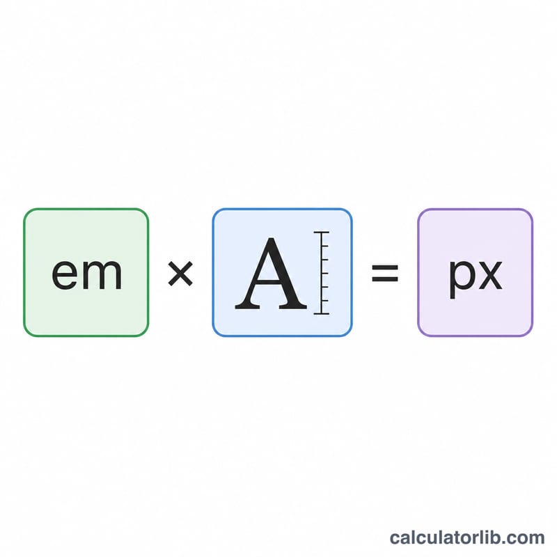
The conversion is a simple multiplication:
$$\text{px} = \text{em} \times \text{base font size}$$
For example, 1.5em at a 16px base equals \(1.5 \times 16 = 24\text{px}\). To go the other way, divide pixels by the base: \(\text{px} \div \text{base} = \text{em}\).
Worked example
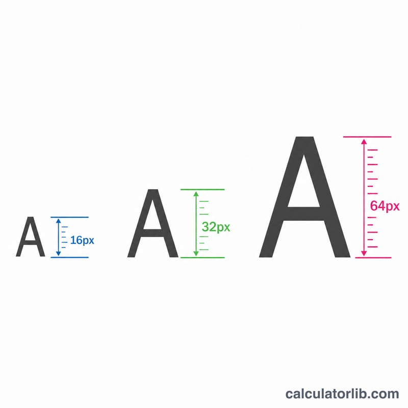
Suppose a heading is set to 2.5em and the base font size is 16px. The pixel size is \(2.5 \times 16 = 40\text{px}\). If the base were 18px instead, the same 2.5em would render at \(2.5 \times 18 = 45\text{px}\) — showing how em scales with the base.
FAQ
Is 1em always 16px? Only when the base font size is the browser default of 16px. If a parent or root font size differs, 1em changes accordingly.
What is the difference between em and rem? rem is always relative to the root (html) font size, while em is relative to the nearest font-size context, which can cascade and compound.
Why use em instead of px? Em units scale with user font-size preferences, improving accessibility and making responsive typography easier to maintain.