What is the PX to EM Converter?
The PX to EM Converter turns pixel measurements into em units used in CSS. Pixels (px) are absolute, while em is a relative unit scaled to a base font size. Designing with em makes layouts more flexible and accessible, since elements scale with the user's font preferences.
How to use it
Enter the pixel value you want to convert and the base font size in pixels. Most browsers default to a 16px root font size, so 16 is the common base. Click calculate to see the equivalent em value.
The formula explained
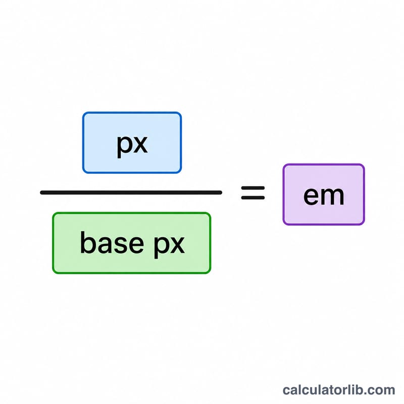
The conversion is simple division:
$$\text{EM} = \frac{\text{Pixel value (px)}}{\text{Base font size (px)}}$$
If your base font size is 16px, then 16px equals 1em, 24px equals 1.5em, and 8px equals 0.5em. Choosing the correct base is critical: em is relative to the font size of the parent element, which may differ from the root.
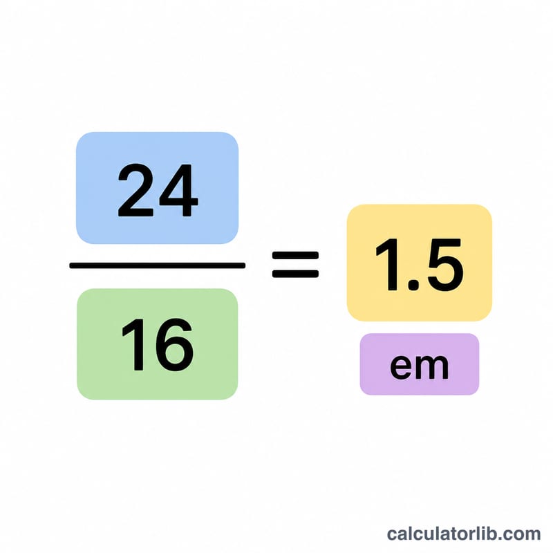
Worked example
Suppose you want to convert 24px with a base font size of 16px. Apply the formula: $$24 \div 16 = 1.5\,\text{em}$$ So a 24px heading becomes 1.5em.
FAQ
What base font size should I use? Use the font size of the element's parent. For root-level conversions, 16px is the typical browser default.
What is the difference between em and rem? em is relative to the parent element's font size, while rem is always relative to the root element's font size.
Why use em instead of px? em scales with user font settings, improving accessibility and responsive design.