What Is the CSS Aspect Ratio Calculator?
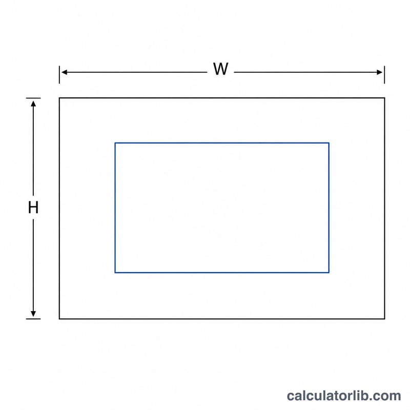
This tool turns any pixel width and height into a clean, simplified aspect ratio such as 16:9 or 4:3. It also computes the classic padding-top percentage used to keep responsive containers (videos, iframes, image wrappers) at a fixed proportion before the modern CSS aspect-ratio property was widely supported.
How to Use It
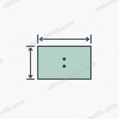
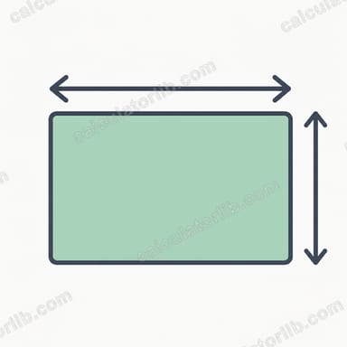
Enter the original width and height in pixels. The calculator reduces the ratio to its lowest terms using the greatest common divisor (GCD), shows the decimal ratio (width ÷ height), and gives the padding-top percentage you can drop straight into your CSS.
The Formula Explained
First, find the GCD of width and height. Dividing both numbers by the GCD produces the simplified ratio. For example, 1920 and 1080 share a GCD of 120, so the ratio becomes 16:9. The padding-top trick uses height ÷ width × 100, because percentage padding is calculated relative to the element's width.
Worked Example
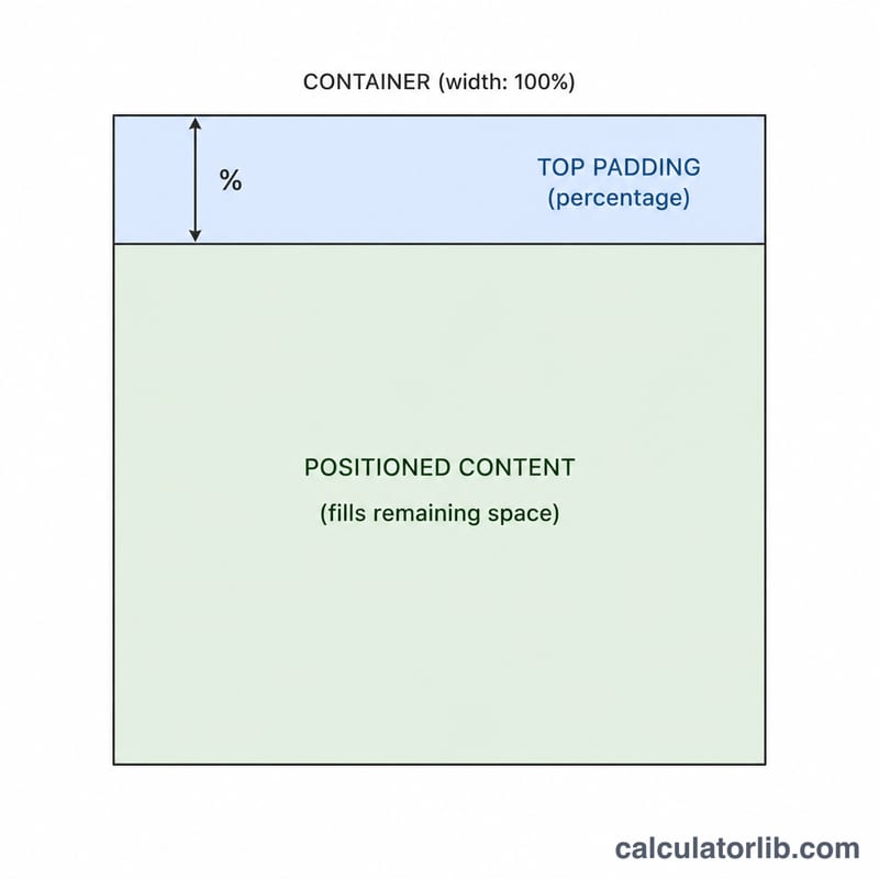
For a 1920×1080 image: GCD(1920, 1080) = 120. Ratio = \(\frac{1920}{120} : \frac{1080}{120}\) = 16:9. Decimal = \(1920 \div 1080 \approx 1.7778\). Padding-top = \(1080 \div 1920 \times 100 = 56.25\%\).
$$\text{Padding-top} = \frac{1080}{1920} \times 100\% = 56.25\%$$So a responsive wrapper would use padding-top: 56.25%.
FAQ
Why use padding-top instead of the aspect-ratio property? The padding-top hack works in every browser, including very old ones. Modern projects can simply use aspect-ratio: 16 / 9;.
Does the percentage use width or height as the base? Vertical padding percentages in CSS are always relative to the containing block's width, which is why the formula is height ÷ width.
What if my numbers don't reduce nicely? Any width and height still produce a valid ratio; it just may not match a common name like 16:9. The decimal ratio is useful in those cases.