What is PX to REM Calculator?
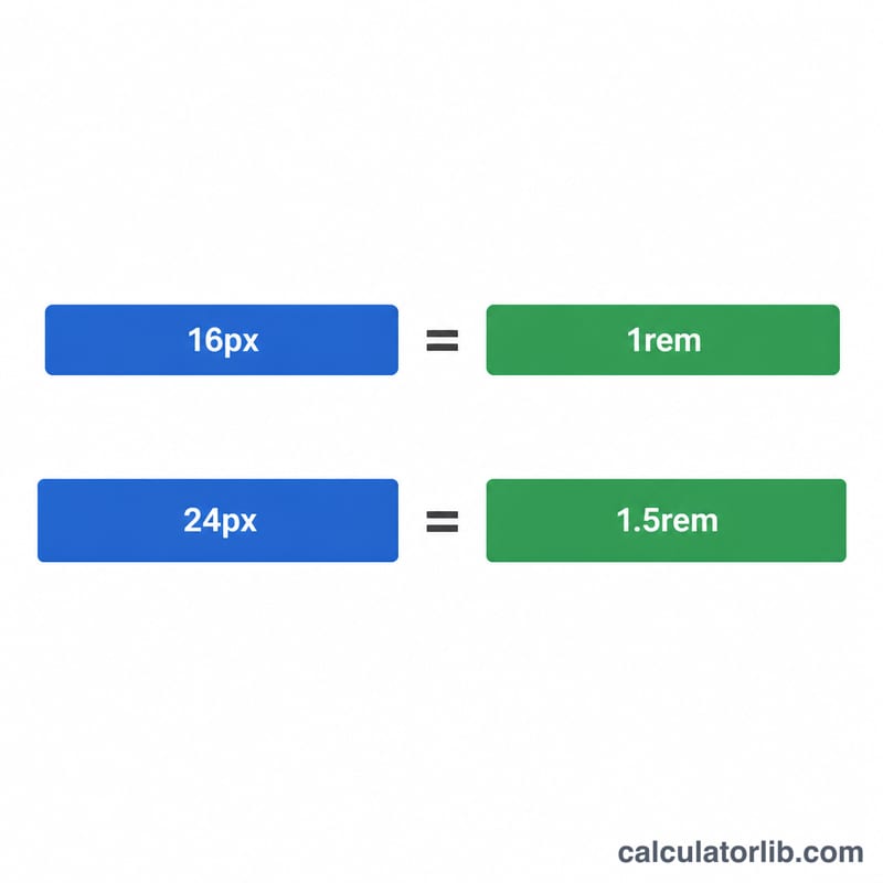
PX to REM calculator is a tool that converts pixel (px) values to rem units, which are relative to the root element's font size in CSS. This conversion is essential for creating responsive and accessible web designs that scale properly across different screen sizes and user preferences.
When to Use PX to REM Calculator
You should use a PX to REM calculator in the following situations:
- When developing responsive websites that need to scale proportionally across different devices
- When creating accessible designs that respect user font size preferences
- When converting an existing design from absolute units (pixels) to relative units (rems) for better maintainability
How to Calculate PX to REM
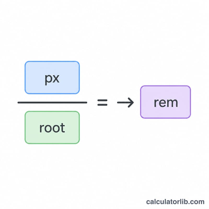
The formula to convert pixels to rems is:
rem = px ÷ root font size
Where:
- rem is the resulting value in rem units
- px is the pixel value you want to convert
- root font size is the base font size of the root element (typically 16px in most browsers)
Examples
Example 1: Converting a heading size from pixels to rems
Convert a heading size of 24px to rems with the default root font size of 16px.
| Input | Calculation | Result |
|---|---|---|
| Pixel Value: 24px Root Font Size: 16px |
24 ÷ 16 | 1.5rem |
Example 2: Converting a margin value with custom root font size
Convert a margin of 40px to rems with a custom root font size of 20px.
| Input | Calculation | Result |
|---|---|---|
| Pixel Value: 40px Root Font Size: 20px |
40 ÷ 20 | 2rem |
Example 3: Converting a small padding value
Convert a padding of 8px to rems with the default root font size of 16px.
| Input | Calculation | Result |
|---|---|---|
| Pixel Value: 8px Root Font Size: 16px |
8 ÷ 16 | 0.5rem |
Common Pixel to REM Conversions
Here's a reference table of commonly used pixel values converted to rems (based on the standard 16px root font size):
| Pixels | REMs |
|---|---|
| 4 px | 0.25 rem |
| 8 px | 0.5 rem |
| 12 px | 0.75 rem |
| 14 px | 0.88 rem |
| 15 px | 0.94 rem |
| 16 px | 1 rem |
| 18 px | 1.13 rem |
| 20 px | 1.25 rem |
| 24 px | 1.5 rem |
| 25 px | 1.56 rem |
| 32 px | 2 rem |
| 40 px | 2.5 rem |
| 48 px | 3 rem |
| 56 px | 3.5 rem |
| 64 px | 4 rem |
| 80 px | 5 rem |
| 300 px | 18.75 rem |
Benefits of Using REMs Over Pixels
Using rem units in your CSS provides several advantages:
- Better accessibility, as rem units scale with user's browser font size settings
- Easier responsiveness by simply changing the root font size in media queries
- More consistent scaling across all elements
- Improved maintainability through proportional relationships between elements
Related Calculators
You might also find these related calculators useful:
Key CSS Unit Terms Explained
Pixel and rem values only make sense once you know exactly what each unit is measured against. These definitions follow the CSS Values and Units specification published by the W3C, which applies to all standards-compliant browsers.
| Term | Definition |
|---|---|
| px (CSS pixel) | An absolute length unit in CSS. It is not necessarily one physical screen dot — it is an abstract unit anchored to the CSS reference pixel. A value like font-size: 16px stays fixed regardless of any parent or root font size. |
| rem (root em) | A relative unit equal to the computed font size of the root element (the <html> element). If the root is 16px, then 1rem = 16px and 1.5rem = 24px. Because every rem in the document refers to the same root value, changing one declaration rescales the whole layout. |
| em | A relative unit equal to the font size of the current element (or, for the font-size property itself, the parent's font size). Unlike rem, em values compound: an element at 1.2em inside a parent at 1.2em of a 16px base computes to \(16 \times 1.2 \times 1.2 = 23.04\)px. |
Root font size / html { font-size } |
The computed font size of the <html> element and the divisor in every px→rem conversion. Browsers ship a default of 16px, but the user can change it in browser settings (accessibility / font-size preferences), and authors can override it — for example html { font-size: 62.5% } to make the root 10px. |
| CSS reference pixel | The spec's definition of the CSS pixel: the visual angle of one dot at a density of 96 dpi viewed from arm's length. It is a unit of visual angle, not of hardware. |
| Device pixel | An actual physical dot on the display. On high-density screens several device pixels map to one CSS pixel; the ratio is exposed in JavaScript as window.devicePixelRatio (for example 2 or 3 on many phones and retina laptops). |
| Rounding / precision | Conversions rarely land on tidy numbers. At a 16px root, \(1\text{px} = 0.0625\text{rem}\) exactly, since \(1 \div 16 = 0.0625\). Values such as \(15 \div 16 = 0.9375\) are also exact, while \(10 \div 12 = 0.8333\ldots\) repeats and must be rounded — 3 to 4 decimals is more than enough, because sub-pixel differences below about 0.01px are invisible. |
One practical consequence: a length written in px ignores the user's chosen browser font size, while the same length in rem scales with it. That is why rem is the usual recommendation for typography, spacing and media-query breakpoints in accessible interfaces.
PX to REM Conversion Table for Common Root Font Sizes
Every cell below is simply \(\text{rem} = \text{px} \div \text{root font size}\), rounded to four decimals (trailing zeros dropped). The 16px column matches the default root font size of every major desktop and mobile browser; the other columns cover roots authors commonly set on <html>.
| Pixels | Root 10px | Root 12px | Root 14px | Root 16px | Root 18px | Root 20px |
|---|---|---|---|---|---|---|
| 1px | 0.1rem | 0.0833rem | 0.0714rem | 0.0625rem | 0.0556rem | 0.05rem |
| 2px | 0.2rem | 0.1667rem | 0.1429rem | 0.125rem | 0.1111rem | 0.1rem |
| 4px | 0.4rem | 0.3333rem | 0.2857rem | 0.25rem | 0.2222rem | 0.2rem |
| 8px | 0.8rem | 0.6667rem | 0.5714rem | 0.5rem | 0.4444rem | 0.4rem |
| 10px | 1rem | 0.8333rem | 0.7143rem | 0.625rem | 0.5556rem | 0.5rem |
| 12px | 1.2rem | 1rem | 0.8571rem | 0.75rem | 0.6667rem | 0.6rem |
| 14px | 1.4rem | 1.1667rem | 1rem | 0.875rem | 0.7778rem | 0.7rem |
| 16px | 1.6rem | 1.3333rem | 1.1429rem | 1rem | 0.8889rem | 0.8rem |
| 18px | 1.8rem | 1.5rem | 1.2857rem | 1.125rem | 1rem | 0.9rem |
| 20px | 2rem | 1.6667rem | 1.4286rem | 1.25rem | 1.1111rem | 1rem |
| 24px | 2.4rem | 2rem | 1.7143rem | 1.5rem | 1.3333rem | 1.2rem |
| 32px | 3.2rem | 2.6667rem | 2.2857rem | 2rem | 1.7778rem | 1.6rem |
| 40px | 4rem | 3.3333rem | 2.8571rem | 2.5rem | 2.2222rem | 2rem |
| 48px | 4.8rem | 4rem | 3.4286rem | 3rem | 2.6667rem | 2.4rem |
| 64px | 6.4rem | 5.3333rem | 4.5714rem | 4rem | 3.5556rem | 3.2rem |
| 80px | 8rem | 6.6667rem | 5.7143rem | 5rem | 4.4444rem | 4rem |
| 96px | 9.6rem | 8rem | 6.8571rem | 6rem | 5.3333rem | 4.8rem |
The 62.5% technique. Because the browser default root is 16px, writing html { font-size: 62.5%; } computes to \(16 \times 0.625 = 10\)px, so \(1\text{rem} = 10\text{px}\) and the mental math becomes trivial: divide the pixel value by 10 and move the decimal point one place left (24px → 2.4rem). Percentages are used rather than font-size: 10px so the root still scales when a user raises their browser's default font size — an accessibility requirement. The trade-off is that you must then set a readable body size explicitly (commonly body { font-size: 1.6rem; } = 16px), since inherited text would otherwise render at 10px.