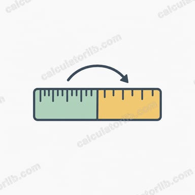
Công cụ chuyển đổi PX sang REM là gì?
Công cụ chuyển đổi PX sang REM giúp bạn quy đổi giá trị pixel (px) sang đơn vị rem — đơn vị được tính tương đối theo cỡ chữ của phần tử gốc (root) trong CSS. Việc chuyển đổi này rất quan trọng khi bạn muốn xây dựng giao diện web responsive và dễ tiếp cận, có khả năng co giãn linh hoạt trên nhiều kích thước màn hình cũng như theo tuỳ chọn của người dùng.
Khi nào nên dùng công cụ chuyển đổi PX sang REM
Bạn nên sử dụng công cụ chuyển đổi PX sang REM trong những trường hợp sau:
- Khi phát triển website responsive cần co giãn cân đối trên nhiều loại thiết bị khác nhau
- Khi xây dựng giao diện thân thiện với người dùng, tôn trọng tuỳ chọn cỡ chữ mà họ cài đặt
- Khi cần chuyển một thiết kế hiện có từ đơn vị tuyệt đối (pixel) sang đơn vị tương đối (rem) để dễ bảo trì hơn
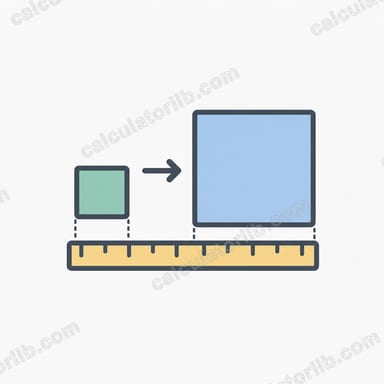
Cách tính PX sang REM
Công thức quy đổi từ pixel sang rem như sau:
rem = px ÷ cỡ chữ gốc
Trong đó:
- rem là kết quả tính ra theo đơn vị rem
- px là giá trị pixel mà bạn muốn chuyển đổi
- cỡ chữ gốc là kích thước chữ cơ sở của phần tử gốc (thường là 16px ở phần lớn trình duyệt)
Ví dụ minh hoạ
Ví dụ 1: Chuyển kích thước tiêu đề từ pixel sang rem
Chuyển kích thước tiêu đề 24px sang rem với cỡ chữ gốc mặc định là 16px.
| Dữ liệu nhập | Phép tính | Kết quả |
|---|---|---|
| Giá trị pixel: 24px Cỡ chữ gốc: 16px |
24 ÷ 16 | 1.5rem |
Ví dụ 2: Chuyển giá trị margin với cỡ chữ gốc tuỳ chỉnh
Chuyển margin 40px sang rem với cỡ chữ gốc tuỳ chỉnh là 20px.
| Dữ liệu nhập | Phép tính | Kết quả |
|---|---|---|
| Giá trị pixel: 40px Cỡ chữ gốc: 20px |
40 ÷ 20 | 2rem |
Ví dụ 3: Chuyển một giá trị padding nhỏ
Chuyển padding 8px sang rem với cỡ chữ gốc mặc định là 16px.
| Dữ liệu nhập | Phép tính | Kết quả |
|---|---|---|
| Giá trị pixel: 8px Cỡ chữ gốc: 16px |
8 ÷ 16 | 0.5rem |
Bảng quy đổi pixel sang rem thường gặp
Dưới đây là bảng tra cứu các giá trị pixel phổ biến được quy đổi sang rem (dựa trên cỡ chữ gốc tiêu chuẩn 16px):
| Pixel | REM |
|---|---|
| 4 px | 0,25 rem |
| 8 px | 0,5 rem |
| 12 px | 0,75 rem |
| 14 px | 0,88 rem |
| 15 px | 0,94 rem |
| 16 px | 1 rem |
| 18 px | 1,12 rem |
| 20 px | 1,25 rem |
| 24 px | 1,5 rem |
| 25 px | 1,56 rem |
| 32 px | 2 rem |
| 40 px | 2,5 rem |
| 48 px | 3 rem |
| 56 px | 3,5 rem |
| 64 px | 4 rem |
| 80 px | 5 rem |
| 300 px | 18,75 rem |
Lợi ích của việc dùng REM thay cho Pixel
Sử dụng đơn vị rem trong CSS mang lại nhiều ưu điểm:
- Khả năng tiếp cận tốt hơn, vì đơn vị rem co giãn theo cài đặt cỡ chữ trên trình duyệt của người dùng
- Dễ làm responsive hơn, chỉ cần thay đổi cỡ chữ gốc trong media query
- Co giãn nhất quán hơn trên toàn bộ các phần tử
- Dễ bảo trì hơn nhờ mối quan hệ tỉ lệ giữa các phần tử
Công cụ liên quan
Bạn cũng có thể thấy những công cụ liên quan sau đây hữu ích: