What is REM to PX Converter?
REM to PX converter is a tool that transforms relative em (REM) units into pixels (PX). In web development, REM is a relative unit that refers to the font size of the root element (typically the <html> element), while PX is an absolute unit. This converter helps developers maintain scalable and accessible designs while understanding the actual pixel values their REM units equate to.
When to Use REM to PX Converter
This converter is particularly useful in the following scenarios:
- When designing responsive websites and you need to convert between relative and absolute units
- When working with design systems that use REM units but you need pixel values for reference
- When implementing designs from mockups that provide measurements in pixels, but you prefer coding with REM units
How to Calculate REM to PX
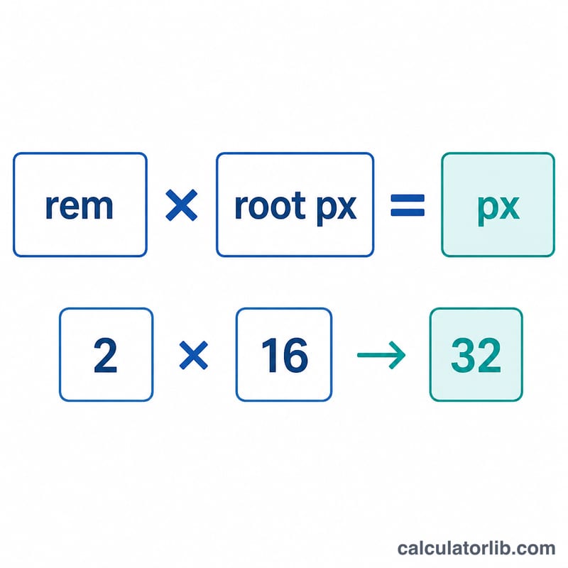
The conversion from REM to PX follows a simple formula:
PX = REM × Root Font Size
Where:
- PX is the resulting pixel value
- REM is the relative em value to convert
- Root Font Size is the base font size of the html element (typically 16px by default in most browsers)
So given that the value of rem is relative on the root font-size. This means that if you assign 16px font-size on <html> on your css, like this one:
This means that 1rem = 16px.

Examples
Basic REM to PX Conversion
Convert 1.5rem to pixels with the default root font size of 16px.
| REM Value | Root Font Size | Calculation | Result |
|---|---|---|---|
| 1.5rem | 16px | 1.5 × 16 | 24px |
Converting Multiple REM Values
Convert 0.75rem, 2rem, and 3.5rem to pixels with a root font size of 16px.
| REM Value | Root Font Size | Calculation | Result |
|---|---|---|---|
| 0.75rem | 16px | 0.75 × 16 | 12px |
| 2rem | 16px | 2 × 16 | 32px |
| 3.5rem | 16px | 3.5 × 16 | 56px |
Custom Root Font Size
Convert 2.5rem to pixels with a custom root font size of 20px.
| REM Value | Root Font Size | Calculation | Result |
|---|---|---|---|
| 2.5rem | 20px | 2.5 × 20 | 50px |
Common REM to PX Conversion Table
Here's a reference table for common REM values converted to pixels (based on the default 16px root font size):
| REM Value | Pixel Value |
|---|---|
| 0.25 rem | 4 px |
| 0.5 rem | 8 px |
| 0.75 rem | 12 px |
| 0.875 rem | 14 px |
| 1 rem | 16 px |
| 1.125 rem | 18 px |
| 1.25 rem | 20 px |
| 1.5 rem | 24 px |
| 1.875 rem | 30 px |
| 2 rem | 32 px |
| 2.25 rem | 36 px |
| 2.5 rem | 40 px |
| 3 rem | 48 px |
| 4 rem | 64 px |
| 5 rem | 80 px |
Related Calculators
To explore more web development and design tools, check out these related calculators:
PX to REM Reverse Conversion Table
While this tool converts REM to PX by multiplying the REM value by the root font size, you often need to go the other way — starting from a pixel value in a design mock-up and expressing it as REM. The reverse formula is simply the pixel value divided by the root font size:
$$\text{REM} = \frac{\text{PX Value}}{\text{Root Font Size (px)}}$$The table below shows common pixel sizes converted to REM at the standard 16px root font size. For example, \(24 \div 16 = 1.5\), so 24px equals 1.5rem (verified in reverse: 1.5rem × 16px = 24px).
| Pixels (PX) | Calculation (PX ÷ 16) | REM Value |
|---|---|---|
| 12px | 12 ÷ 16 | 0.75rem |
| 14px | 14 ÷ 16 | 0.875rem |
| 16px | 16 ÷ 16 | 1rem |
| 18px | 18 ÷ 16 | 1.125rem |
| 24px | 24 ÷ 16 | 1.5rem |
| 32px | 32 ÷ 16 | 2rem |
If your project uses a different root font size, replace 16 in the calculation with your actual value. Note that the popular "62.5% trick" sets the root to 10px (62.5% of 16px), which makes conversion effortless because every 10px equals exactly 1rem.
Key Terms Explained
- REM (root em): A relative CSS length unit measured against the font size of the root (
<html>) element. One REM always equals the root font size, so at a 16px root,1rem = 16pxand2rem = 32px. Because every REM references the same root value, scaling the root resizes REM-based layouts consistently across the whole page. - PX (pixel): An absolute CSS length unit representing a single device-independent dot on the screen. Pixels do not scale with user or parent font-size settings, which makes them predictable but less flexible for accessible, responsive typography.
- EM: A relative unit like REM, but measured against the font size of the current element (or the parent element for properties other than
font-size), rather than the root. This means EM values can compound when nested — a1.2emelement inside another1.2emelement yields an effective 1.44× scale. REM avoids this cascading by always referencing the single, fixed root value. - Root font size: The font size applied to the
<html>element, which is the anchor value that every REM unit is multiplied by. Settinghtml { font-size: 20px; }makes1rem = 20pxeverywhere. Using a percentage (e.g.100%) here respects the user's browser preferences, aiding accessibility. - The 16px default: Virtually all modern browsers apply a default
font-sizeof 16px to the<html>element unless it is overridden. This is why 16px is the standard assumption for REM-to-PX math and the default used by most conversion tools, including this one.