
What is a Pareto chart?
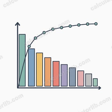
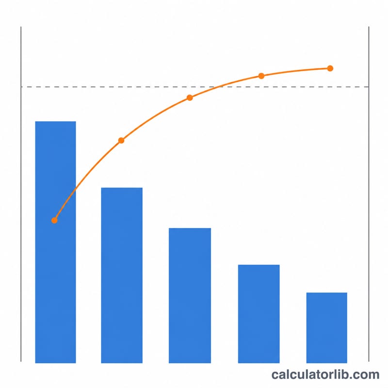
A Pareto chart combines a descending bar chart with a cumulative-percentage line. It is built on the Pareto principle, often called the 80-20 rule, which observes that a small number of causes are responsible for the majority of effects. This calculator takes a list of category values, optionally sorts them from largest to smallest, then computes the grand total, each value's share of the total, the running cumulative total, and the cumulative percentage. The result is a ready-to-read table plus a Pareto chart you can use for quality control, root-cause analysis, inventory ABC analysis, or any prioritization task.
How to use it
Type a category label (optional) and a numeric value on each row. Choose Sort (descending) to order the bars from largest to smallest as a classic Pareto chart requires, or Do not sort to keep your input order. Pick the number of significant digits used for display. Leave rows blank to ignore them. The calculator outputs each value's percentage, the cumulative total, and the cumulative percentage (the last row always reaches 100%), along with bars and a cumulative-% line.
The formula explained
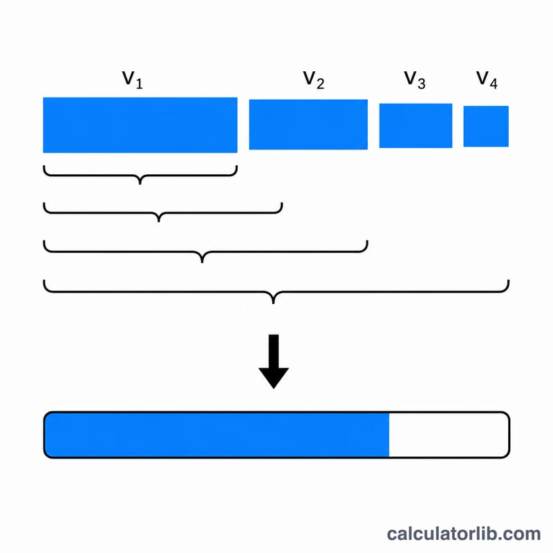
Let the values be \(v_1, v_2, \ldots, v_n\). The grand total is \(T = \sum v\) (sum of all values). For each row \(i\) the individual percentage is $$\text{Percent}_i = \frac{v_i}{T} \times 100,$$ and the cumulative percentage is the running sum up to row \(i\) divided by \(T\), times 100: $$\text{Cumulative \%}_i = \frac{\sum_{k \le i} v_k}{T} \times 100.$$ If \(T\) is zero, percentages are undefined, so the tool reports 0% instead of dividing by zero.
Worked example
Defect counts: \(A = 50\), \(B = 30\), \(C = 12\), \(D = 8\), with sorting on (already descending). Grand total \(T = 100\). Row A: $$\frac{50}{100} \times 100 = 50\%,$$ cumulative 50, 50% cumulative. Row B: $$\frac{30}{100} \times 100 = 30\%,$$ cumulative 80, 80% cumulative. Row C: $$\frac{12}{100} \times 100 = 12\%,$$ cumulative 92, 92% cumulative. Row D: $$\frac{8}{100} \times 100 = 8\%,$$ cumulative 100, 100% cumulative. The cumulative line climbs \(50 \to 80 \to 92 \to 100\), showing the top two causes account for 80% of all defects.
FAQ
Do I have to sort the data? A true Pareto chart is sorted in descending order, but you can disable sorting to preserve a fixed category order (for example a time sequence).
Can I use percentages or money instead of counts? Yes. Any non-negative magnitudes work; the math is the same.
What about an "Other" bucket? Best practice keeps a combined "Other" category last even when sorting. This tool sorts every value equally, so place and label an Other row yourself if you need that convention.