
What this tool does
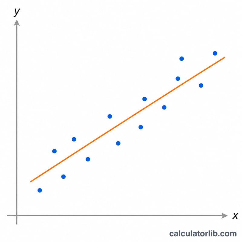
The Scatter Plot Generator turns a list of paired observations into a visual scatter chart and a complete set of summary statistics. Each point combines an independent value (x) and a dependent value (y) — for example outdoor temperature versus ice-cream sales. The chart shows how the two quantities move together, while the numbers quantify that relationship: the Pearson correlation coefficient \(r\), the coefficient of determination R squared, the means and sample standard deviations of each variable, the sample covariance, and the equation of the least-squares best-fit line. This is a universal statistics utility — it works with any pair of measured quantities and is not tied to any country or unit system.
How to use it
Type one (x, y) pair per line in the box, separating the two numbers with a comma or a space — for example 30, 60. Enter at least two points; more points give a more reliable correlation. Blank or non-numeric lines are ignored. Press calculate to see the scatter plot with the dashed regression line drawn through it, plus a table of all descriptive statistics.
The formula explained
First the means are found: \(\text{meanX} = (\sum x) / n\) and \(\text{meanY} = (\sum y) / n\). Deviations from the mean are then combined. The slope of the best-fit line is $$a = \frac{\sum (dx \cdot dy)}{\sum dx^2}$$ and the intercept is $$b = \text{meanY} - a \cdot \text{meanX}.$$ The Pearson correlation \(r\) equals the sum of (dx·dy) divided by the square root of (sum dx² × sum dy²): $$r = \frac{\sum (x_i - \bar{x})(y_i - \bar{y})}{\sqrt{\sum (x_i - \bar{x})^2 \,\sum (y_i - \bar{y})^2}} \qquad \left(x_i, y_i\right) \in \text{Data Points}$$ and R squared is simply \(r^2\). Sample (n-1) versions are used for variance, standard deviation and covariance.
Worked example
For x = [22, 24, 26, 28, 30, 32, 34] and y = [25, 30, 38, 45, 60, 70, 78], \(n = 7\), \(\text{meanX} = 28\) and \(\text{meanY} \approx 49.43\). Sum dx² = 112 and sum (dx·dy) = 522, so the slope $$a = \frac{522}{112} \approx 4.661$$ and intercept \(b \approx -81.07\), giving the line $$y = 4.661x - 81.07.$$ The correlation \(r \approx 0.991\) and \(R^2 \approx 0.983\) — a strong positive linear relationship.
FAQ
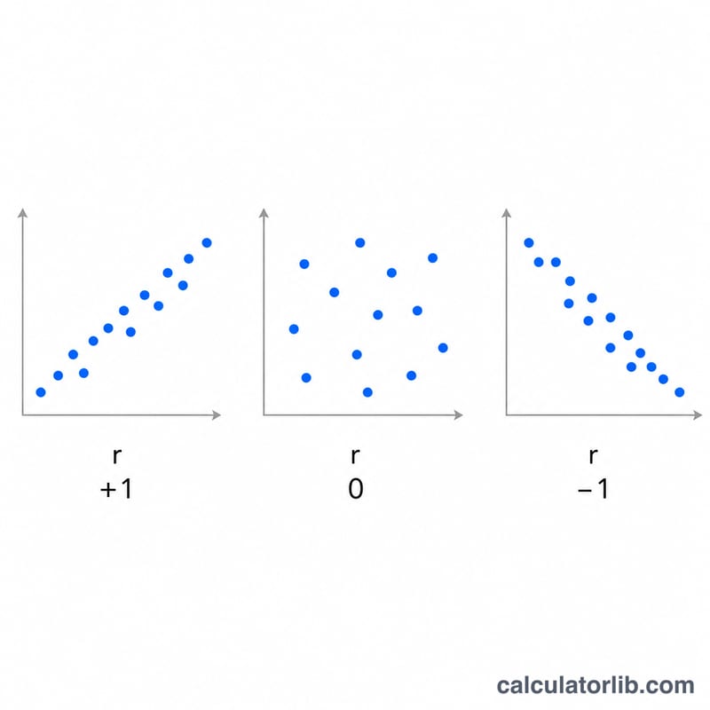
What does the correlation \(r\) mean? Values near +1 mean a strong increasing linear trend, near -1 a strong decreasing trend, and near 0 little or no linear relationship.
What if all my x values are identical? Then x has no variation, the slope and \(r\) are undefined, and the best-fit "line" is the vertical line \(x = \text{meanX}\).
Does correlation prove causation? No. A high \(r\) only shows the variables move together; a third factor (such as temperature driving both coffee and ice-cream sales) may be the real cause.